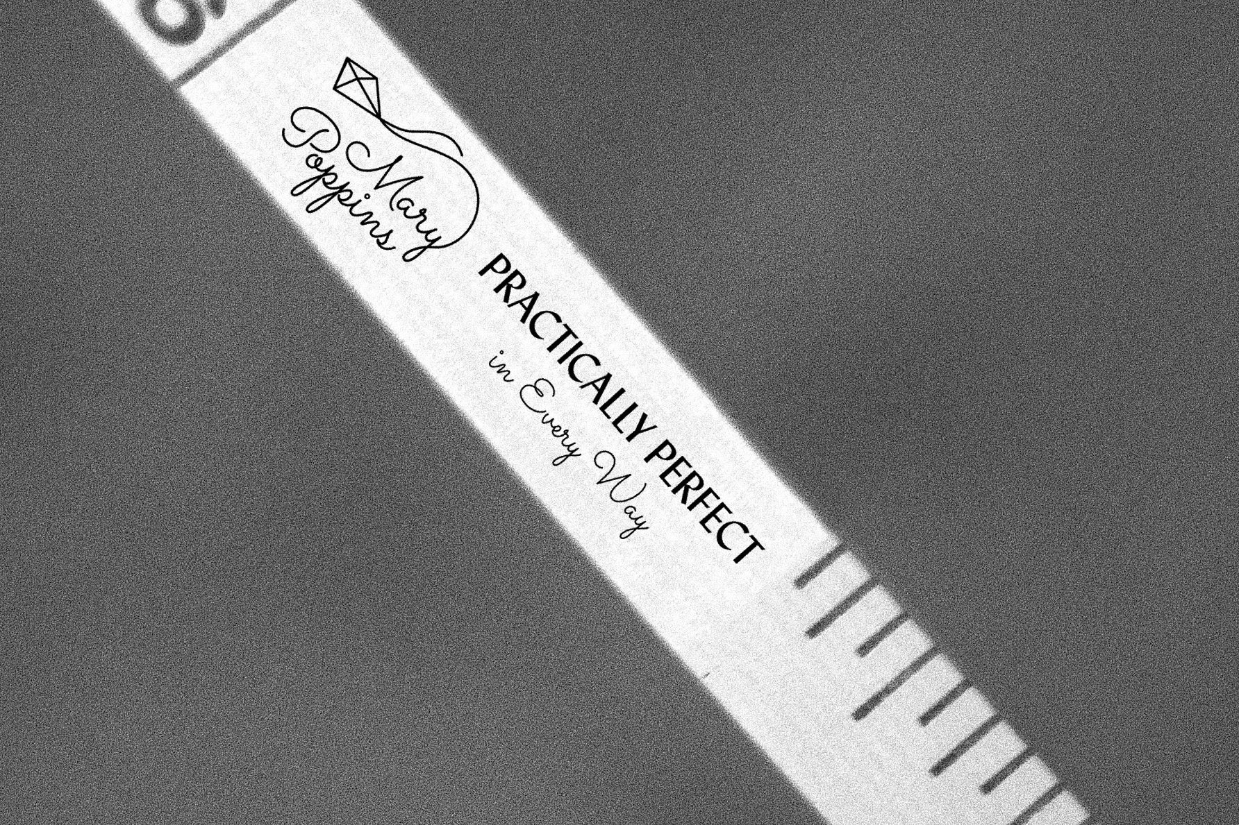
Mary Poppins Commemorative Book
SERVICES:
Editorial, Packaging, Typography
OBJECTIVE:
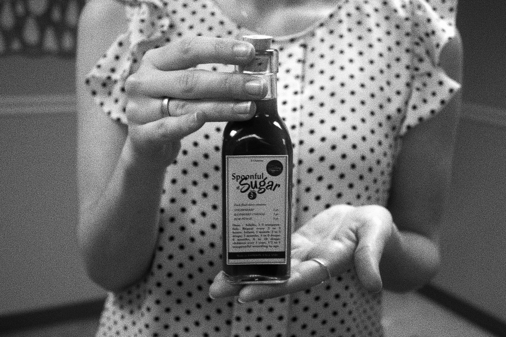
To design a commemorative book and graphic props about a movie set in a different time period, from the original, addressing the appropriate and desired typography, style, colors, and layout.
SOLUTION:
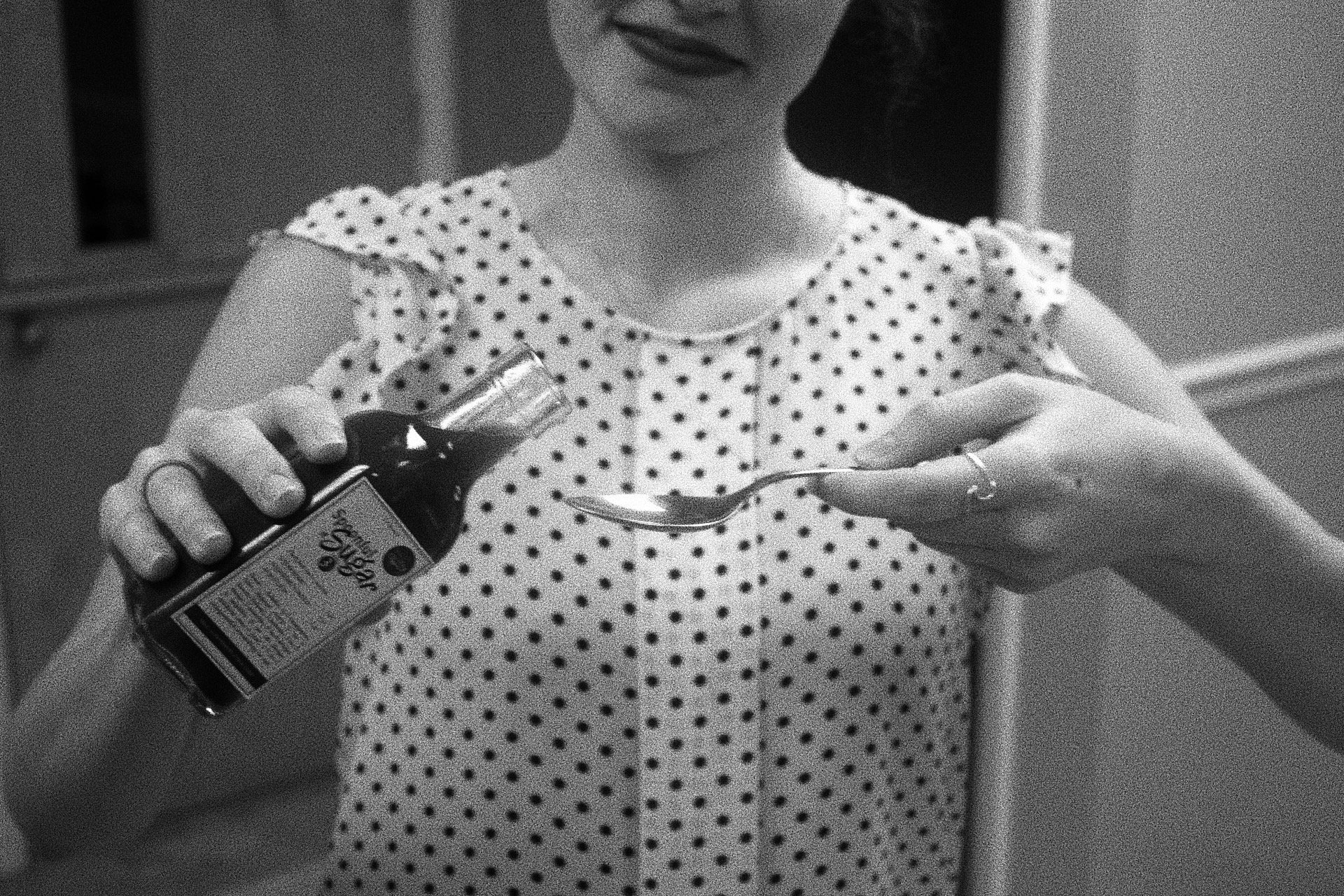
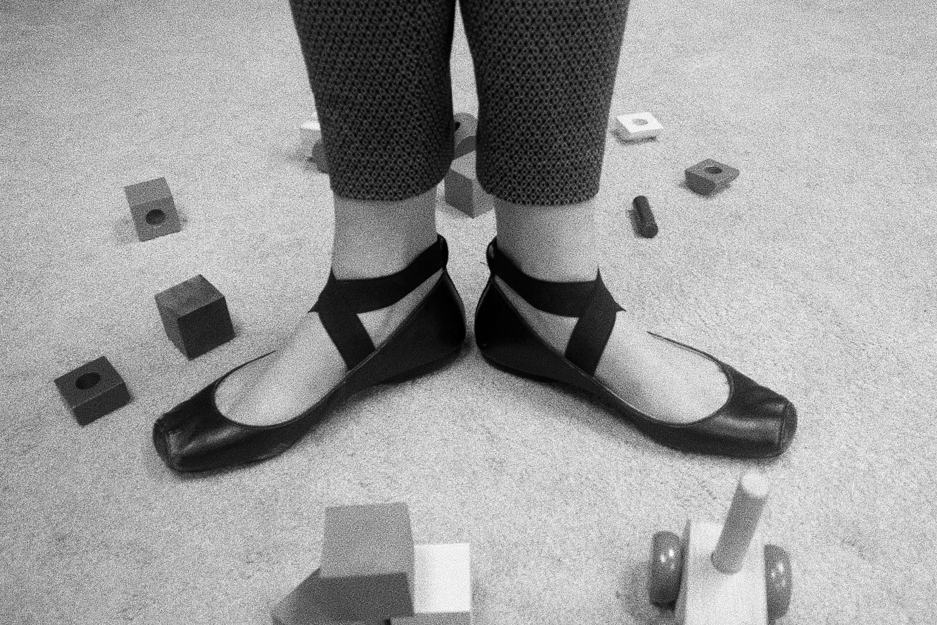
I created a behind-the-scenes book based on the movie “Mary Poppins” as if it were set in the 1950s. The main focus of this project was how to use typography to be more than a font, and expand it within the concept to the logo, patterns, and movie props. I was inspired by the 20th-century graphic designer, Bradbury Thompson, for the use of my color palette: cyan, magenta, yellow, and black.